Blog Archives
My life right now…
…with my fingertips glued, mostly, to the keyboard…
OR…
Why I’ve been going on and on and on and on about my graphic designs (for now) …
 You folks who have been following my blog for a while know that I’ve gone through periods where I talked about dance and nothing but dance.
Then there were long periods where I talked about loosing weight, eating healthy and getting fit and pretty much nothing else.
In fact, there have been periods where just about any and every topic under the sun became the “topic dee jur” for several “jurs” where I talked about that thing a LOT… and nothing else but that for a while. (my friends from France just probably had a heart attack at my butchering of their native tongue. Sorry guys. 🙂
Why do you get stuck on the same topic for a while? I hear the teeming multitudes (all fourteen of you) asking…????
Because well, I blog about my life. And whatever is going on in my life at that moment. And I’ve been working a LOT on these designs lately trying to get as many as possible online and ready for people to buy in time for the Christmas Season.
AND because I see the end of my 401k (on which I’ve been living) coming to an end in Feb,
AND sales from these designs are one possible replacement for that money and a way to remain self-employed,
AND I hurt my left arm / shoulder about two months ago and it still hurts and working on the computer (and these designs) is something I can do that doesn’t make the arm/shoulder hurt worse
AND THOSE things, dearest readers, are topics for another blog post. The topic “de jur” is:
How was that for wicked teasing? Hmmm? (One must confess that I’m grinning like a bad boy at the moment) Watch for an update on those other tantalizing tidbits later…
But I digress. I do that you know… 😉
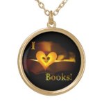
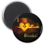
My latest design
 You fine folks reading this…
(didcha catch my witty pun?) look to the right at the design… Get it? *snort* *giggle*
I started off with “reading” in the sentence. ROFL [slapping knee and grinning foolishly] And my design *guaff* *snort* *giggle* is about BOOKS! Woot!
I crack my self up sometimes…. See what happens when I do a blog entry with only three sips of coffee in me? Be afraid. Be very afraid. 😉
Anyway… long time readers of this blog may recall that I have a Masters Degree in Library Science. And, until early last year, I worked as a Librarian.
I love to read. Well, duh. LOL
So here is a design with that in mind: “I love books” / “I ♥ books”
Since this is just the fourth post in this new series, here is a reminder about the format. Each post will have three parts:
- A large image of the new design
- A bit of background on how the design came about (just below)
- A few of my favorite products with the new design (just below that)
I hope you are enjoying the “back story” on the designs as I create them.
Even if you don’t visit the store and do some shopping, please hit the share and like buttons so that others can find out about my designs. Thanks!
Background on my latest design:
 One of the things that I knew early on was that I actually have very little drawing skill. I mean I have a good size chunk of creative talent, all modesty aside, but the mechanical skills involved in picking up a pencil or paintbrush are things that I just do not have in my toolbox.
I can envision what I want but I lack the skill to actually produce it in a traditional “artistic” sense. Thankfully graphic design doesn’t really require 100% creation from a blank page, or in this case a blank screen.
You can build upon the works of others. So part of what I do is look for photos or clip art which is CC 3.0 BY, CC 3.0 BY-SA, or Public Domain. (If you want to read more about it what those letters mean, check out the first article in this series)

I love books – original photo. Licensed under CC 3.0 BY jamarmstrong on flickr.com
I start with an idea, which is mine. All mine, then I start scouring the Internet for images which are kinda sorta what I want and with work and modification in a graphics program will fit the idea I have in mind.
I wanted to do a “I love books” design. And I found this photo. I really loved the warmth of the colors but there were several problems from the standpoint of a “graphic” for shirts, mugs etc. Here’s what I did to turn it into a more workable design:
- Square fits more products than rectangle designs and are easier to work with
— So I added extra background to the top and bottom
— I smudged and blended the extra bits so they looked like part of the original photo - When using text in a design “Level” is best
— so I rotated the image to level out the pages of the books - Clarity and focus are important
— meaning that elements which muddle the picture have to be removed, so the red bookmark ribbon was removed
— and since the “heart” created by the pages is definitely the focal point of the photo, I moved the book over, cropped one side, added borders on the sides (like I did for the top and bottom), smudged and blended so it looked like part of the original photo. -

The letter “I” with a color gradient matching the original photo.
Big is better
— (getcher mind outta tha gutter!) *ahem* Go ahead. Laugh. Get it out of your system. *sigh* Moving on… The small text in the original photo was removed
— I looked for a “dramatic” font online (one which had commercial permission)
— I then used the MAC Text Edit program to create a black version of the font; I did a screen grab to convert the “text” into “graphics” and imported the “I” and “books” into GIMP, the program I use for working on my designs.
— I then reversed the colors making the text white and the background black. I deleted the white, making it transparent.
— Then, and here’s the cool part… I pasted the now, transparent text onto the photo, moved it around until parts of the warm yellows and reds and golds showed through and when I found a spot I liked, I then took another screen shot, got rid of the “black” background, making it transparent, leaving the text in glowing warm colors which matched the photo. Tah-Dah!
— Then it was just a case of moving the text around until I liked the positioning. Woot!
For the record, I am quite proud of myself. Why?… I hear the teeming masses (all three of you) asking…?
 Because, dearest readers, I had to LEARN to do all that flippin stuff. Fiddlin’ and Finagalin’ with Fotos ain’t like makin’ coffee! Sheesh! Can we say “learning curve?” OMG! No wonder graphic designers / computer geeks get paid so much! For the record, understanding layers for me was the hardest part. It is finally starting to click but only in the most basic sense.
An-Knee-Ways…. I’ve come a long way. And it is all self-taught. Just little ole me (and lots of very helpful YouTube videos) learning how to do it. And I’ve only scratched the surface of what is possible. *grin*
In all seriousness, what makes me so proud of this design is that I had this picture in my head. And the final design came out very much like what I had in mind. Woot!
My favorite products with the new design…
As a reminder, since this is only the fourth announcement of designs using this new “standardized format”… I’ll share with you a few of the products from the first batch on which I think the new design looks awesome. If you want to see all the products with this design, then click on one of the many links scattered through this post and hop on over to the store… Cheers!
-

- Shirts are available for men, women, kids and in a wide range of styles and colors
-
- Wow. I love how the gold finish compliments the design
-
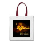
- Uhmm.. it’s a book bag. Mandatory inclusion I think. 🙂
-

- The canvas art thingies are expensive but this time round I thought this looked cool enough to include the link.
-

- Cool, functional. Perfect stocking stuffer.
-
- Perfect for the fridge. Even more perfect to use to hold up the date due slips for the library books.
-

- I don’t know why but the mousepads often end up looking good with the designs.. Go figure.
-

- I’ve been waiting for this. This is listed as an “award” on Zazzle but in my mind it looks like a paper weight. And it looks cool with this design.
-

- Again, one of the more expensive items on Zazzle but I’ve included it because well it looks awesome!
Share with folks on the Interwebz :-)

Coffee Kitty is NOT a Morning Cat… Uhmmm… Person
Given how sleep deprived I am this morning…

c2013 TxCowboyDancer Designs
…this design is somehow very appropriate.
Since this is only the second in this new series, here is a reminder about the format. Each post will have three parts:
- A large image of the new design (like the one to the right)
- A bit of background on how the design came about (just below)
- A few of my favorite products with the new design (just below that)
I hope you are enjoying the “back story” on the designs as I create them.
Even if you don’t visit the store and do some shopping, please hit the share and like buttons so that others can find out about my designs. Thanks!
Background on my latest design:
I don’t remember where I first saw this cat. I think it was either on Facebook or maybe it popped up in a Google search. I’ve slept since then… 😉
Following the trail back to the source of the image lead me to a website called Deviant Art; a site I had never visited before. Wow, talk about a different part of the Interwebz! LOL

This was the image that I first saw… I Need Coffee Original sketch by (by YTCyberPunk)
If you’ve never heard of Deviant Art, check it out. It is a lot of fun, but a lot of, well, deviant, in a good “artistic” way. Basically it is a place for artists and photographers to hang out and share their work, comment and critique, and take a peek at what other artists and photographers are doing.
Some of the work on the site is jaw dropping amazing. Some of it is amusing. Some of it, quite frankly, is awful. Not awful in the sense of lack of inspiration or effort but in execution—sorta baby works by artists who still have “training wheels” on their paint brushes or mouses. Mice? Miceses?
Whatever you call more than one computer mouse. But hey, art is in the eye of the beholder, and all of it is fun. Think “coffee house” in Soho with local artists works on the wall, and you get the idea… only without the coffee and it is on the Internet instead of in New York… but anyhoo…
Hmmm… coffee must be on my brain this morning… Slllllluuuuuurrrrrrrrpppppp…. Ahhhhhhhhhhhhhh….
You know you are truly hooked when you are only a third of the way through your first cup of coffee and there is NO WAY the caffeine can actually be hitting your system yet, but your body reacts physiologically to the mere promise of more caffeine hitting the blood stream soon. *SIGH*

I Need Coffee (by YTCyberPunk) Cleaned up Ink Version
But I digress.. I do that you know…
So… on the Deviant Art website, has a way for visitors to purchase a digital copy of the artwork for their personal non-commercial use like putting it on a computer desktop as the background. Or printing it off and framing it and hanging it on the wall.
But I didn’t want the image for personal use. I wanted to edit the design and I wanted to sell the design on products like t-shirts and coffee mugs. So, having never done this before, I said “what the hey” and took a chance. I emailed the artist and asked her if she’d consider selling me the commercial rights to her drawing, including the right to edit the drawing and add captions.
It turns out that the “drawing” was just a doodle she had done during class and that she’d never actually ever sold one of her works before and was very flattered that I liked her drawing.
Since we were both “babes in the woods” so to speak, we talked it through, making the contract up as we went. We eventually agreed that she retain copyright on the original drawing and that I would have copyright on any modifications based on her drawing.
I sent her a payment and in exchange I got a cleaned up copy of the drawing from her and the commercial rights to print the modified versions on t-shirts etc. Coolness! My first official bizness KNEE-go-she-Ayh-SHUN! Woot!

Storyline showing development of the design as I edited it
When I got the cleaned up “pen and ink” version, I decided that actually liked the original “messy” pencil version better.
So working with both the original “messy” file and the ink “clean” version, I took a bit of this and a bit of that and did a lot of clean up and editing of the “messy” version.
I added color to it a little at a time. I did some MORE clean up, adjusted proportions, shortened the height of the steam, and eventually after several hours of work with a graphics program…
Tah-Dah. I had a design I liked and that was ready to go onto products.
My favorite version is the cream colored cat. But I am playing around with the colors and will at some point in the future have a black and white version and a grey scale version as well. Watch for those. 🙂
Or I might change the color of the coffee cup or I might use the ink version. Who knows. But I’ll have to have more coffee first. LOL
I just LOVE the expression on this cat’s face. Especially since it is so close and contrasts so nicely with the big “smiley” face on the mug! Woot!
My favorite products with the new design…
I had a LOT of fun coming up with captions for the bumper stickers and mugs, etc for this design. I’m a coffee drinker and NOT a morning person AT ALL so this is a topic near and dear to my caffeinated heart. Read the rest of this entry


